
Color Theory in Fashion
Topics covered:
- Link to color wheel
- Proportionate mixing of color
- Mixing Equal Parts
- Mixing Proportionate parts
- The Mixing Ratio for Primary Colors
- The significance of white and black in color mixing
- Importance of the opacity of the medium in color mixing
- Can we use or make any formula for mixing colors?
- Swatching and color charts/ mixing recipe book
- The various types of the above charts and significance of each
- How to make Colors which are not in tertiary and artist use it frequently like Brown, White, Black, Gold, Silver (Other than secondary and tertiary colors)
- How to mix colors for various skin tones for portraits?
- What is visual isolation and how it helps identify the right colors?
- What is meant by muddy color and how to not end up mixing a muddy color (Do’s and don’t’s)
- When is there a separation in colors on paper? Is it good or bad to see the separation of colors on an artwork?
- The technique of identifying color from reference images to be able to mix colors appropriately
- What is an undertone and what is the importance of the under-painting or lean layer in oil painting?
- Making different types of green
- Importance of color mixing
- Important points to remember while mixing colors
- FAQ
Ever wondered how designers, creators, and artists find the perfect color combination?
Have you ever wondered how the paint comes from a tube or a pan on paper, lying perfectly next to the color that enhances it?
How to achieve the perfect green color that we want for a tree in the shade?
Want to know what colors look perfect together?
The answer is color theory and color mixing. Color theory is a practical combination, detailed study of art and science used to determine what colors look good together, how we can achieve a particular color and the different terms to study the hue. In 1666 Sir Isaac Newton invented the color wheel and mapped the color spectrum into a circle or the wheel. It is the basis of color theory because it shows the relationship between colors and how they react with or beside each other.
It’s important to understand the color wheel for the study of color mixing. Mixing colors of light that is a spectrum and mixing colors of paint produce very different results. While mixing the primary colors of the light makes white, primary colors of paint properties create black, grays or brown.
Refer to the color wheel blog before you continue to read about color mixing. It’s the foundation to understand color mixing
Proportionate mixing:
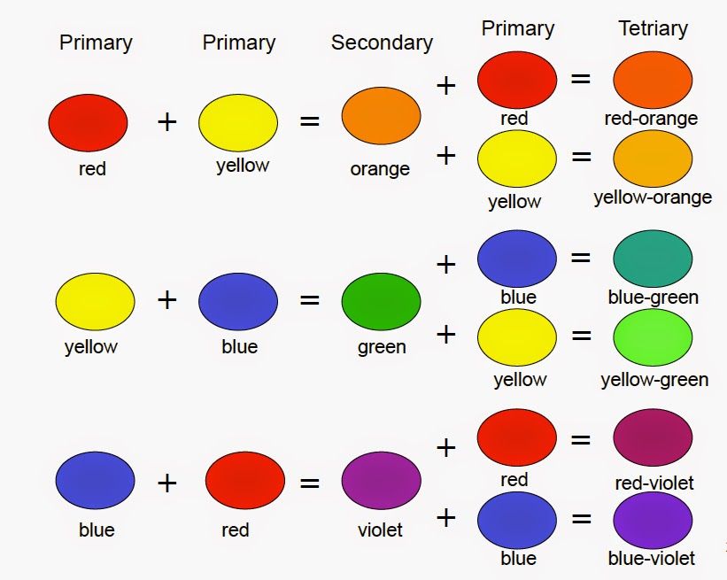
Mixing Equal Parts: The basic color mixing formula involves mixing equal amounts of two or more colors. If any two primary colors are mixed in equal amounts, the result is a secondary color:
1 Red + 1 Yellow = Orange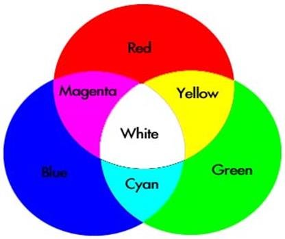
1 Blue + 1 Yellow = Green
1 Red + 1 Blue = Violet
Mixing two secondary colors in equal amounts creates a tertiary color, such as-
1 Orange + 1 Green = Olive
1 Violet + 1 Green = Slate
1 Orange + 1 Violet = Brown
Mixing two tertiary colors in equal amounts creates a quaternary color, such as:
1 Brown + 1 Slate = Cedar
1 Slate + 1 Olive = Sage
1 Brown + 1 Olive = Coffee
Mixing in equal quantities gives a clear picture.
Mixing Proportional Amounts-
To create a wide range of new colors, primary colors can be mixed using various colors in different proportions to each other. Mixing paints using proportional color mixing formulas ensures that a specific color can be duplicated, allowing a creator to provide consistency and uniform appearance in color mixing.
Proportional color mixing involves simple ratios, like using twice as much red as yellow, or complex formulas, such as mixing one part blue, two parts red, and three parts yellow. Each combination will produce a new, distinct and interesting result.
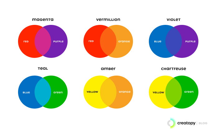
The proportional color formulas involve mixing two parts of a primary color to one part of a different primary color to create a tertiary color as given below;
2 Red + 1 Blue = Magenta
2 Blue + 1 Red = Purple
2 Blue + 1 Yellow = Teal
2 Yellow + 1 Blue = Chartreuse
2 Yellow + 1 Red = Amber
2 Red + 1 Yellow = Vermilion
The Mixing Ratio for Primary Colors:
To get orange, you mix the primary colors red and yellow. The mixing ratio of these two colors determines which shade of orange you will get after mixing. For example, if you add more red than yellow, you will get a reddish-orange. Similarly, if you add more yellow than red, you will get a yellowish-orange.
It also depends on the temperature of the color that you choose. So experiment with the shades you have. Try different combinations and mixing ratios, and keep a written record of your results so that you can obtain the same color in the future. Therefore it is easier to say that different shades of reds mixed with different shades of yellows will not produce the same orange color.
Everything depends on which secondary color and shade you want to create. If you mix a Hansa yellow with red carmine, you will get a different shade of orange than with Gamboge yellow.
Are there Different Shades of Red, Blue, and Yellow to Buy?
Yes! You can choose from a variety of different shades of primary colors.
Here are some examples:
Blue: Cobalt blue, cerulean blue, ultramarine blue, Caribbean blue, Venetian blue, Prussian blue,
Red: Cadmium red, scarlet, carmine, crimson, and Venetian red
Yellow: Naples yellow, gamboge, cadmium yellow, lemon yellow, and yellow ochre
The significance of white and black in color mixing-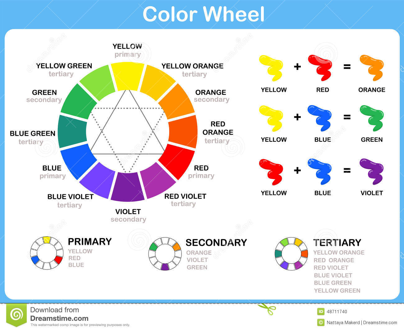
While it may seem logical that to lighten a color, you need to add white to it, white reduces brightness or saturation, so although it makes a color lighter, it removes its vibrancy. It produces a tint of that color and makes a transparent color opaque. It also cools the color. This is most noticeable with red, which changes from a warm red to a cool pink when you use titanium white.
Watercolors are transparent, so to lighten, you simply add more water to paint to let the paper shine through.
Black doesn’t add darkness but creates murkiness & tends to dirty the base colors rather than simply darken them. Of all ordinary blacks, Mars black is the blackest and is opaque, ivory black has a brown undertone, and lamp black a blue undertone.
Nevertheless, there are instances in which black is uniquely valuable, such as the range of greens it can produce when mixed with yellow.
Importance of the opacity of the medium in color mixing-
Different pigments have different properties. Some pigments are highly transparent and are evident from underneath multiple layers of paint. Others are highly opaque. Considering this could further assist you in the process of layering your work.
The color mixing in watercolor would differ from color mixing in acrylic paints or oil paints. Traditional water paints do not encourage the usage of white and blacks, while acrylic and oils do not work efficiently without the two. It’s important to know which category your art medium falls into to better understand the painting process.
It’s important to understand the summary about the paints & other pigment-based materials to further study color mixing in-depth as artists.
Every medium is pretty much created from the same sources of powdered pigment. Some colors are derived directly from nature, and others are man-made or synthetically produced. When the powdered pigments are mixed with various additives, which are called binders, the following are then created –
Oil paints: As the name implies, pigments are mixed with oil (usually Linseed) in the tube, which is slow drying & easier to blend. It can be used straight from the tube or thinned down with the medium for under-painting or glazing. Oils maintain their intensity once dry, unlike water-based paints, which tend to dry darker or lighter than when wet.
Water-soluble oils: This kind of paint is Inter-mixable with traditional oils. Water can be used to clean the brushes if it is used in pure form.