
Fashion and Colour
Oil sticks: These contain waxes that bind the pigment to a stick—slow drying as oils. Solvents are the same as oil paint.
Acrylics: This medium contains an emulsion creating a non-soluble waterproof, plastic surface when dry. It can be used diluted with water or used straight from the tube without dilution. Texture pastes can be added for impasto or a 3d effect. Replacing the water in the jar and thorough cleaning of the brushes after every paint session is advised to eliminate paint clinging to the brush. It can be used on any non-oily surfaces from paper to board & canvas. Acrylics cannot be reactivated in the same way as watercolors or gouache. So, to test out a unique color made from multiple colors, mix it in small quantities until you can fix the formula for it. Else you will end up with a lot of undesirable color on your palette that could go to waste.
Gouache and poster colors: It contains a binder that remains water-soluble when dry. Pigments are generally of a coarser or gritty quality than watercolors and are therefore more opaque or non-transparent. It can be re-activated for further blending using water.
Watercolors: Watercolors of higher quality are derived from the most finely ground pigments. They are created by the addition of special water-soluble gum-arabic. This medium is used on watercolor papers having a smooth, rough or texture that lies in-between the two. It is essential to know that despite being a transparent medium, there are watercolors that incline more towards being opaque. These lack vibrancy and dry out dull on paper. One of the best examples for this is black. That is the reason why artists advise learners to mix a color closest in resemblance to it rather than using the color straight from the tube unless it is to obtain certain hues.
Watercolor pencils: These are used for line drawing, adding texture and depth, or activated on paper after laying down the colors.
Pastels: Here, the pigments have been molded into sticks using distilled water and a minimum of binders. Some are wrapped in waxed paper to prevent breakage and come in stick form. These are usually used on toned paper with a texture or “tooth” to hold the dry granules of pigment. Spray fixatives prevent rubbing but tend to darken the pastel work. Framing is behind glass with a matt board to avoid the work from touching the glass.
Inks: Inks are available as waterproof and water-soluble inks. Very fine pigments are used, and good quality inks can provide luminosity over white, which can be increased by adding layers when using waterproof varieties. It can be used with brushes, sponges, etc. Inks can be loaded into oblique pens for various line weights. The nibs need to be cleaned frequently.
Can we use or make any formula for mixing colors?
There are a few color mixing formulas that are popular among artists to achieve the desired colors. This is especially true in the case of achieving beautiful colors by mixing the primaries like ultramarine blue with earthy or neutral colors to obtain colors that are de-saturated and incline towards colors seen in nature. These are colors that appear subtle and visually pleasing to the eye.
Here are some examples of formulas for neutral colors widely used by artists:
Ultramarine blue + Red brown/ Vermillion = De-saturated purple
Ultramarine blue + White + hint of pink/ red = Lavender
Lavender + Yellow Ochre = Yellow Gray
Colors derived from Ultramarine Blue
These are usually a result of a study of the color wheel and what has been proven to work best. While most artists mix colors based on experience, some admit to have been mixing colors based on instinct while painting the picture. Thereby it becomes essential to understand what color complements another color that you have used.
A popular example for this could be the use of a deep warm purple (closely resembling the color of a plum) alongside yellow because these two colors fall opposite to each other on the color wheel and thereby complement one another. If you study paintings with architectural subjects, you might notice how such a color has been used to indicate shadows on a building or a door that is yellow.
Swatching and color charts/ mixing recipe book. The various types of the above charts and significance of each
Before proceeding to use any color on any paper, always take a small piece of the paper and paint on it using this color. You could just try a single color at a time which is termed as ‘swatching’ or work on different charts. Colors appear different on different papers due to the properties of the paper.
Different types of charts you could create for yourself are:
The color wheel
- The mixing chart (Applicable to all mediums)
A mixing chart is structured as a grid of equal number of rows and columns. You can generate for example, a grid of 8 x 8 and paint single colors in the first row and first column in same order and discover the corresponding color by combing 1 color from a row with one color in the column.
Watercolor mixing chart
- The glazing chart (Applicable for watercolor)
Since watercolor is a transparent medium, a glazing chart helps you understand what your first layer appears from underneath the second transparent layer. Start with the lightest hues such as yellows first as they are more prone to color contamination.
Choose a good quality of paper for this as the lighter colors appear better on sheets of better quality.
Watercolor glazing chart
- Dual-color mixing charts
Mix two colors in varying proportions to identify unique color mixes
- Value chart
A single color can be indicated in different value across a picture. Observe that carefully. It is an indication of how dark or light a color is conveyed depending on the area of light and shadow. Try a monochrome study with just black before working on a value chart with any color.
- Palette chart
It guides you towards the real appearance of a color mix on the paper when compared to what it appears like on the palette
How to make Colors which are not in tertiary and artist use it frequently like Brown, White, Black, Gold, Silver (Other than secondary and tertiary colors)
- White:
White is a color that cannot be mixed from other colors. There are two pigments for white that are known to us: Titanium white and Zinc white. If the tube reads “Chinese white”, it is mostly made out of zinc with traces of titanium white sometimes. Zinc white inclines towards being a cool color and relatively more transparent whereas, Titanium white is a warm white and opaque in character.
Ideally, it is best to use white to create emphasis in a painting rather than mixing it with another color as it could make your painting appear dull.
- Brown:
A basic brown color can be created by mixing all the three primary colors in nearly equal quantities. The quantities of colors can be varied to obtain varying shades of brown.
Alternatively, brown can be created by combining the following:
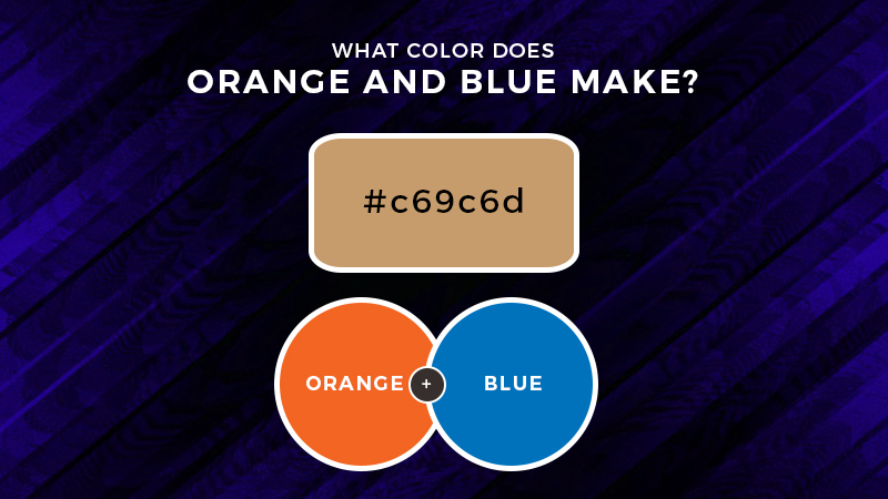
- Orange + Blue
It is important to note that the colors need to be mixed in equal parts. This might vary from the formula mentioned earlier depending on the orange being used.
Another method is to mix blue with yellow to form green (say, Prussian Green). When you mix this with red or variants of red such as Vermillion or red brown, you obtain a very dark shade of brown which can serve as a substitute for black in some areas.
Prussian Green + Orange/ Vermillion
- Black
It is no joke when artists recommend you to mix all colors on the palette to form black. A color closest to black is obtained when you mix red, blue and green. Which is nothing but:
Red+ Blue + (Yellow + Blue)
Color mixing to form brown, black, grey, and gold
- Grey
Grey color is basically formed by combining black with white.
- Warm Gray
Warm grey is obtained by mixing small quantity of brown to a basic grey
Blue + Yellow = Green
Green+ Red (small quantity) = Brown
Grey + Brown = Warm Gray
- Cool Grey
1 part Blue+ 1 part Black+ small quantity of white
The resultant color will have a cool tone
- Silver
Silver in any image is nothing but gray with a sheen. To convey silver color in a painting, try mixing any of the following and indicate a highlight in white for reflectivity.
Ultramarine blue + Burnt Sienna = Warm Gray
Cobalt Blue + Burnt Sienna = Soft silver gray
Phthalo Blue + Burnt Sienna = Greenish gray
If you’re aiming for a shimmery effect, there are paints with pearlescent and shimmery pigments available.
- Gold
If an object in a reference resembles the color gold, artists tend to associate it with colors that classify as either yellow or brown. It might have a hint of olive green in it if the metal is antique.
However, if you are keen on mixing your own color from the primaries, here’s a formula you could try:
1 part Red + 1 part Yellow + 1 part Black
You can adjust the tone by mixing a small part of the primary colors until you obtain the desired gold color.
How to mix Gray and gold
How to mix colors for various skin tones for portraits?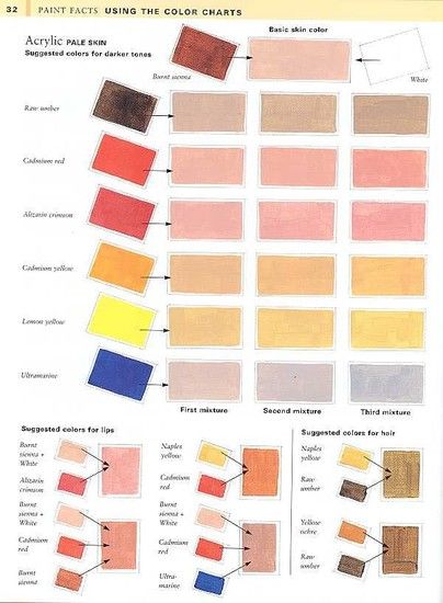
The appearance of skin has either a warm or cool undertone. People with a paler complexion mostly have a cooler undertone of blue. However, people having a darker complexion tend to have a warm undertone such as olive green. You can make an informed decision on choosing the colors by carefully trying to observe and understand the tone that you’re trying to achieve.
The first layer of a portrait should indicate the undertone. This holds true while working with watercolors. One or two layers can be built above this using colors such as scarlet, orange, raw umber, burnt sienna, burnt umber, etc.
In case of oils, it may be the colors that are usually opted for an under-painting. Skin tones can be formed by first mixing a basic brown color. This is done by mixing equal parts of the three primary colors.
If the skin tone is darker, this mix can be altered in tone by adding a small amount of red, yellow or brown depending on the color you want. You may add black to attain a darker color.
If a paler complexion is to be achieved, mix a red (for example, alizarin crimson) with say, lemon yellow and continually add white till a flesh tint is obtained.
Blush tones– Add a hint of crimson to the pre-mixed skin color to obtain a natural color to indicate a blush tone.